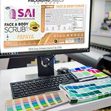
Nothing delays a label order like artwork that needs rework. The good news: print-ready files follow a short, learnable checklist. This tutorial covers exactly what your label printer needs - and why - so your job moves straight from approval to press.
Step 1: Start From the Dieline
The dieline is the exact cut shape of your label, supplied as a vector outline on its own layer. Always design inside the dieline your printer provides (or request one before starting). Keep the dieline as a spot colour set to overprint - never merge it into the artwork.
Step 2: Set Bleed and Safe Zones
- Bleed: extend backgrounds and images at least 3 mm beyond the dieline on all sides so tiny cutting variations never leave white slivers.
- Safe zone: keep text, logos and barcodes at least 3 mm inside the cut edge.
- Curved containers: allow extra safe margin near vertical edges where wrap-around tension is highest.
Step 3: Get Colour Right (CMYK vs Pantone)
Design in CMYK, not RGB - screens show colours print cannot reproduce. For brand-critical colours (your logo red, a signature teal), specify a Pantone (PMS) number; presses can then match it as a dedicated ink or a calibrated simulation.
Rich black tip: for large black areas use a rich black mix (e.g. C60 M40 Y40 K100); for small body text use 100 K only, so registration stays razor sharp.
Step 4: Handle Fonts and Strokes
- Convert fonts to outlines (or embed them) before export.
- Minimum recommended text size: 4 pt positive, 5 pt reversed (white text on dark).
- Minimum stroke width: 0.25 pt positive, 0.5 pt reversed.
Step 5: Images at the Right Resolution
Placed images should be 300 ppi at final size. Upscaling a small web image will print soft. Vector artwork (logos, illustrations) scales infinitely - prefer it wherever possible.
Step 6: Barcodes That Actually Scan
Keep barcodes black on white, at 80% magnification or larger, with quiet zones intact. Avoid printing barcodes in colour or reversing them. For GS1 sizing rules, see our barcode printing guide.
Step 7: Mark Special Finishes on Separate Layers
Foil, spot UV, embossing and white-ink areas each need their own clearly named spot-colour layer (e.g. “FOIL”, “SPOT-UV”, “WHITE”). This is how premium effects like the ones in our premium label guide are communicated to press.
Step 8: Export Correctly
- Export PDF/X-4 (preferred) with bleed and dieline layers intact.
- Do not flatten transparency manually - let pre-press handle it.
- Include a view PDF or JPEG so intent is unambiguous.
No designer on your team? Sai Impression offers free artwork checks and full design & pre-press support - send us what you have and we will make it press-ready.
Pre-Flight Checklist (Copy This)
- Dieline on its own spot-colour layer ✔
- 3 mm bleed, 3 mm safe zone ✔
- CMYK + named Pantones only ✔
- Fonts outlined ✔
- Images 300 ppi ✔
- Barcode black, ≥80%, quiet zones ✔
- Finish layers named ✔
- PDF/X-4 export ✔
FAQ
What file format should I send my label printer?
A layered PDF/X-4 exported from Illustrator or similar, with dieline and finish layers as named spot colours, fonts outlined and 3 mm bleed. Native AI files are a good accompaniment.
Why does my printed label look duller than my screen?
Screens are RGB and backlit; print is CMYK and reflective. Designing in CMYK with a calibrated proof avoids the surprise. Critical brand colours should be specified as Pantone references.
How much bleed do labels need?
3 mm is the safe industry standard for roll labels. Some very small labels can work with 2 mm - but never design with zero bleed.
Can I use Canva for label artwork?
Canva works for simple designs if you export PDF Print with bleed and convert to CMYK afterwards - but complex jobs with dielines, white ink or foil layers are better prepared in professional tools, or handed to your printer to finish.